


Overview
The Veggie Butcher is a concept for a new service that grocery stores provide, that works in a similar way that the deli and the meat counters currently function.
As an effort to encourage Americans to eat more fresh fruits and vegetables, this service prepares produce to order, so that shoppers can take it home and easily and quickly incorporate it into their meals.
Project Name: The Veggie Butcher
Client: Hass Avocado Board
Era: VCU Brandcenter, 2014
the Rationale
The concept is based on the insight that Americans are oversaturated with prescriptive campaigns telling them they should eat healthier to the point that it has become background noise.
However, studies show that simply adding fresh fruits and vegetables into their current diet while making no other changes, consumers can make a small, manageable, non-obtrusive step towards a healthier lifestyle on their terms and at their pace.
But for someone who is unaccustomed to preparing and cooking fresh produce, the produce section of the grocery store can be daunting and requires a lot of effort to have to think about the possibilities, requirements and other elements that could potentially arise from these new additions to their diet.
the idea
You know you should incorporate fresh fruits and vegetables into your diet, so you buy some carrots and potatoes at the grocery store. But then what? What do you do with them? What can you add them into? How do you prepare them? Do you even have the time to prep them at all?
Our solution was providing grocery shoppers with a revolutionary in-store service provider called the Veggie Butcher.
Much like the deli and the meat counter, the Veggie Butcher's job would be to prep produce to order and package it for the shopper to bring home and easily incorporate into their meals.
Campaign


interface walkthrough


Interactive Prototype
So where would it go?
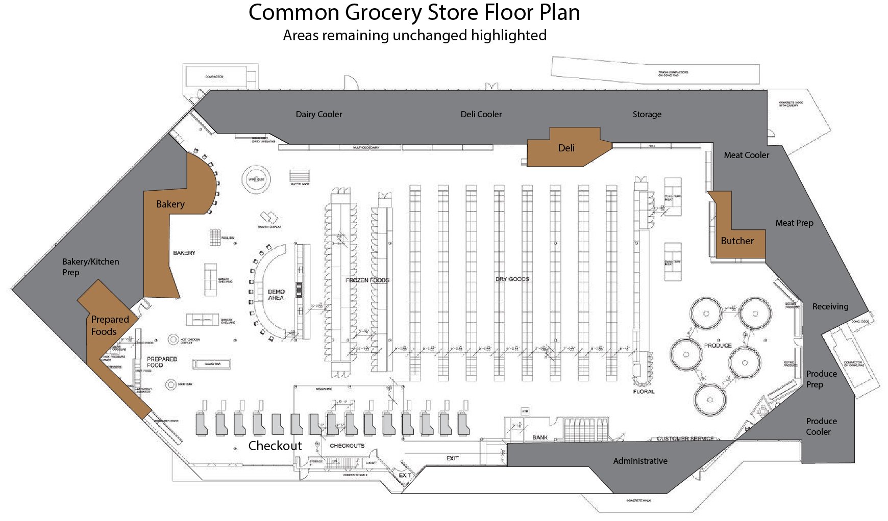
In addition to the Veggie Butcher concept, we also presented an idea for a grocery store layout redesign.
Grocery stores for the most part have similar layouts, and for a reason. The categories of product are laid out in such a fashion to force people to walk straight through the store to encourage impulse shopping and therefore increase revenue. Studies have shown, though, that those layouts tend to be overwhelming and can cause navigational-based anxiety in shoppers, not to mention it's been this way for 50 years.
Stores like Stew Leonard's have found large success in recent years by implementing a single lane walkthrough layout; however, those stores tend to have a more niche market and also that particular layout style forces people to walk through the entire store even if they only need one item. This isn't necessarily bad, but this does not solve the issue of large chain grocery stores and their much larger inventory.
Keeping the same placement theories that modern grocery stores still use, like keeping the dairy section in the far back of the store and the perishable foods around the edges (for refrigeration and stocking purposes), I redesigned a large scale grocery store with a main thoroughfare walkthrough with directional arrows for ease of use and cut-throughs for those who are only there to pick up, say, milk and eggs. What this also does is create more end cap space for retailers, encourage shoppers to impulse-buy, and create a new, more engaging experience for grocery store shoppers, all while creating more revenue for the store.